What was the focus of the Silent Wheel Branding project?
Brand identity, visual direction, and practical print touchpoints.
Visual direction, practical detail, and a finish made for the real-world touchpoint.
Making the first delivery feel consideredAn envelope is often the first physical part of a brand that a customer sees. This Silent Wheel design uses the available surface carefully so the package feels intentional…
A closer look at the decisions, structure, and finish behind this selected project.
An envelope is often the first physical part of a brand that a customer sees. This Silent Wheel design uses the available surface carefully so the package feels intentional before it is opened.
The visual treatment keeps the identity visible without overwhelming the format. Placement, contrast, and spacing help the envelope work with letters, documents, and business communication.
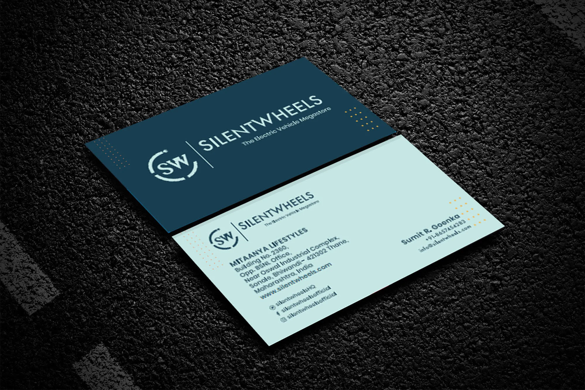
The project shows how a consistent identity can move from a logo and business card into practical stationery that supports trust at every handover.
Open the project visual for a larger view. Each selected project image is shown here as part of the full project gallery.
A few plain answers for anyone comparing similar design work.
Brand identity, visual direction, and practical print touchpoints.
Logo & Branding Design work, including Clear visual hierarchy, Useful across real touchpoints, A finish that stays easy to use.
Yes. Share your brief, audience, and intended use through the contact page and Swap Design can suggest a practical starting point.