Logo & Branding Design
Ashna Mehndi Logo
A clear identity for a detail-led service Ashna Mehndi needed a mark that felt personal without becoming decorative noise. The direction keeps…
SWAP DESIGN / SELECTED WORK
A selection of logos, branding, websites and campaigns crafted for clients across India and worldwide.
Selected work / 18 projects
I keep each project focused: a clear idea, a useful structure and a finish that feels right for the people using it.
Selected logo & branding design work, built around a clear idea and a usable finish.
Explore this set
A clear identity for a detail-led service Ashna Mehndi needed a mark that felt personal without becoming decorative noise. The direction keeps…

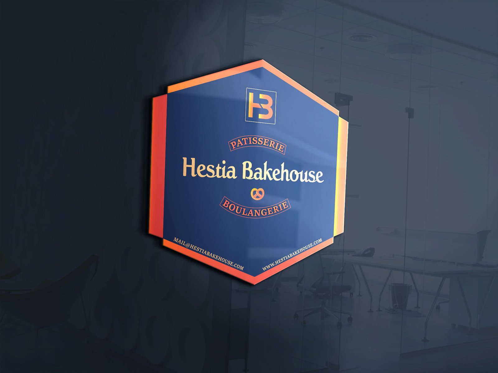
Warmth before decoration Hestia Bakehouse needed an identity that felt welcoming from the first glance. The visual direction uses a simple, approachable…
Making the first delivery feel considered An envelope is often the first physical part of a brand that a customer sees. This…

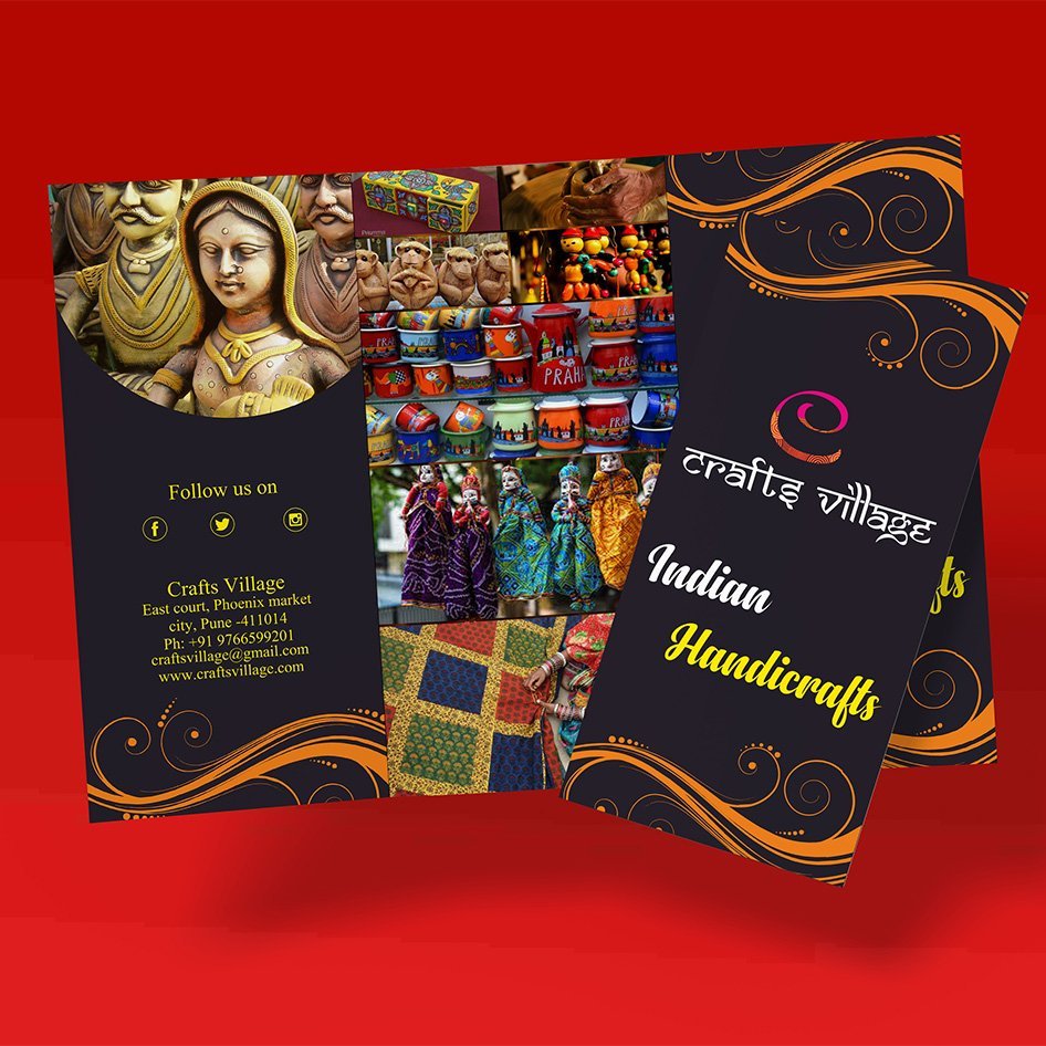
Information that feels easy to explore Craft Village needed a brochure that could present its story and offerings without turning every page…

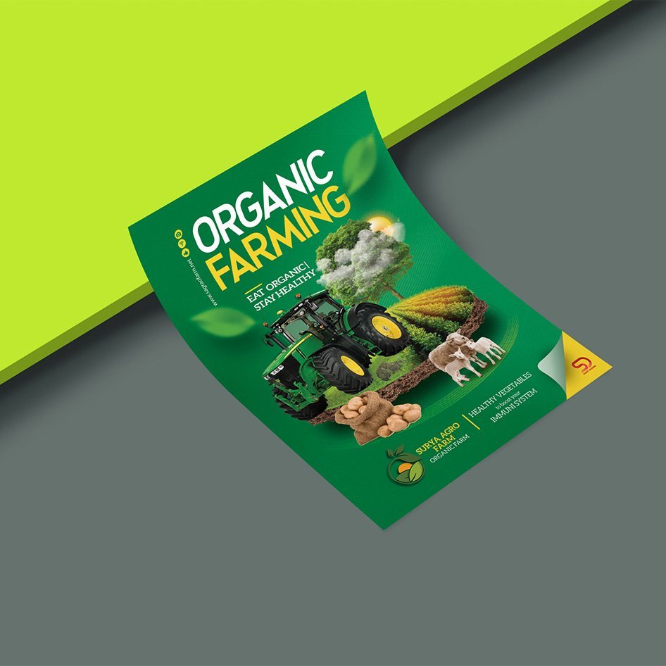
Putting useful information first This farming pamphlet was shaped for readers who need to understand the message quickly. The layout gives key…
Selected graphic design work, built around a clear idea and a usable finish.
Explore this set
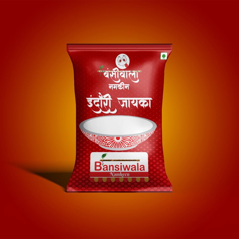
Making the pack easy to notice Bansiwala Namkeen needed packaging that could feel familiar, appetising, and easy to recognise at a glance.…

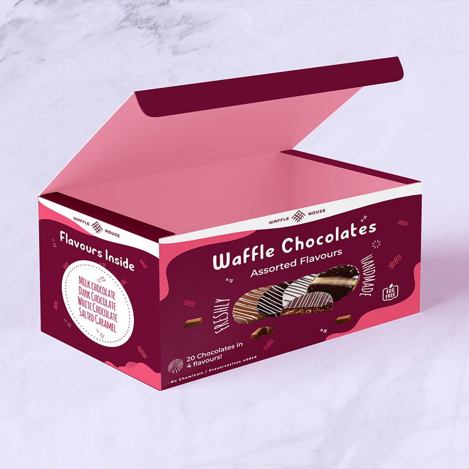
A visual cue people understand quickly This packaging project focuses on making the waffle product feel tempting before the pack is opened.…

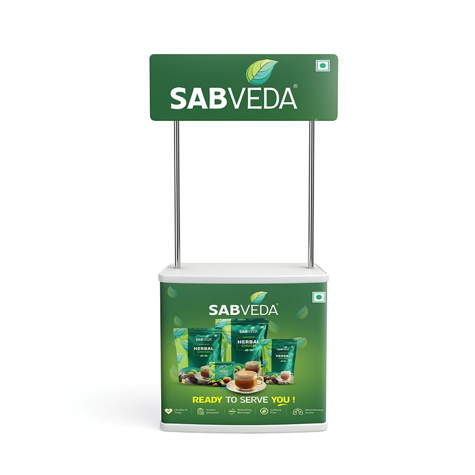
Visibility from a distance Sabveda needed event graphics that could be noticed in a busy environment and understood without a long explanation.…
Selected website design & development work, built around a clear idea and a usable finish.
Explore this set
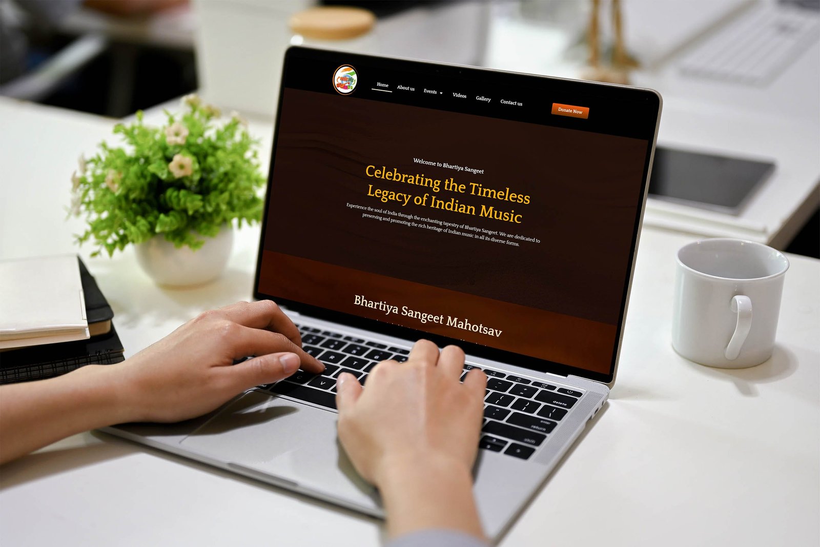
Giving the content a clear stage Bhartiya Sangeet needed a website that could present its musical identity without making visitors work to…

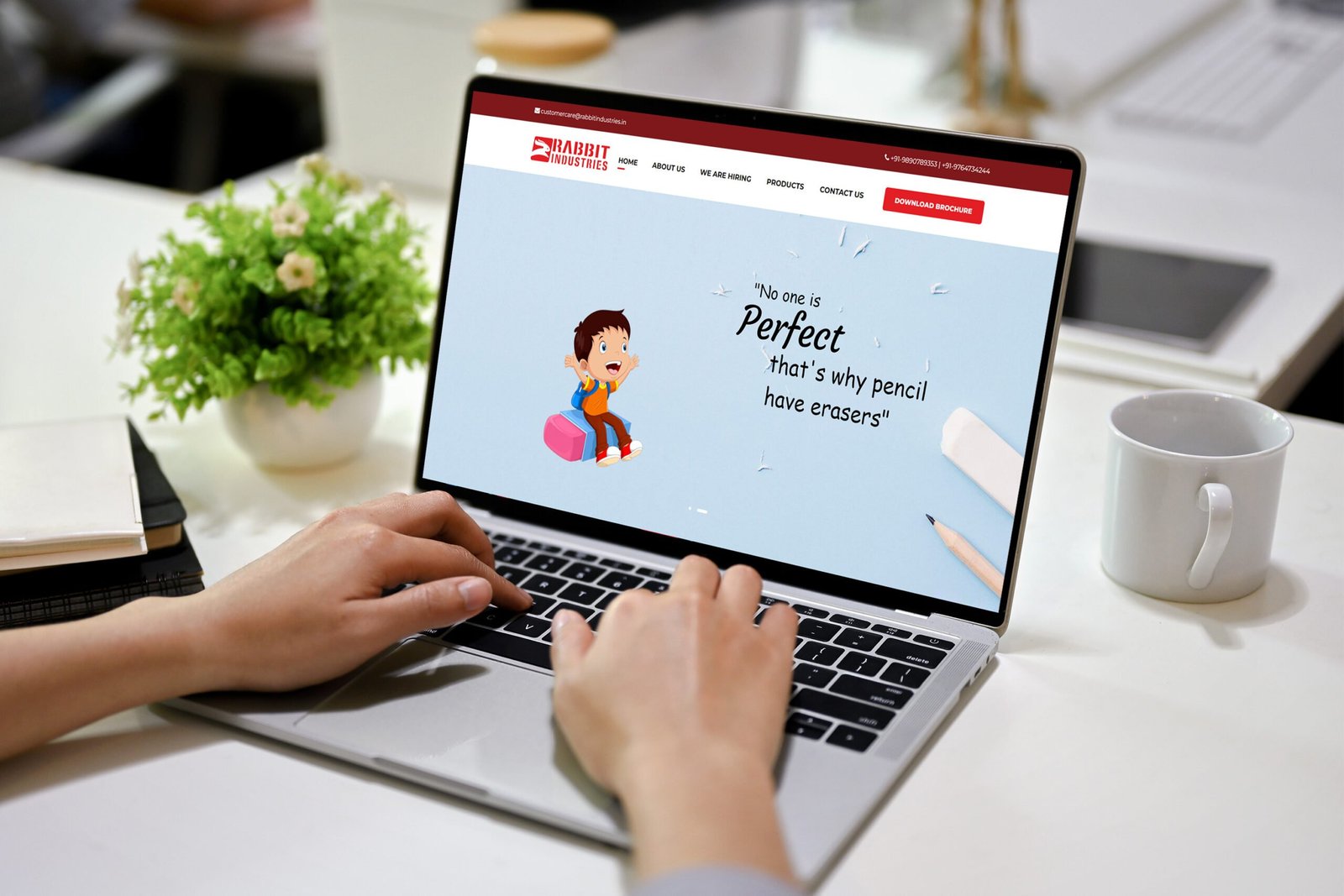
Turning a business story into a usable page Rabbit Industries needed a digital presence that could explain its work clearly and help…

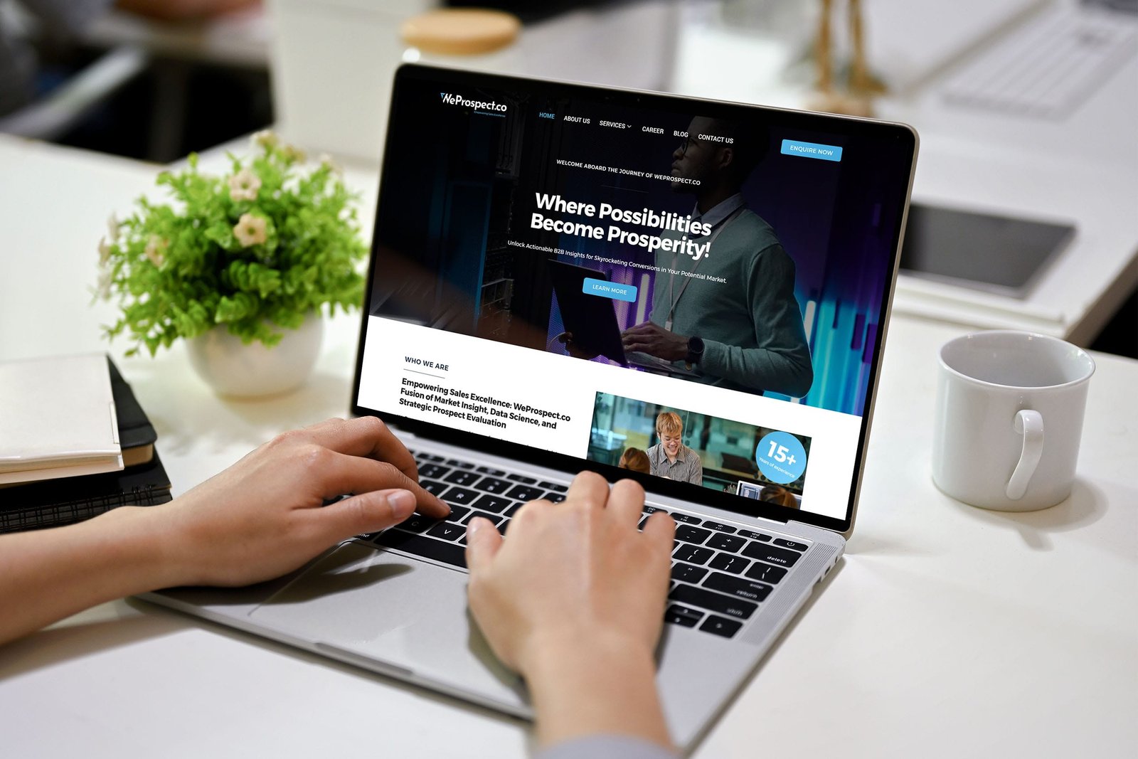
Making the offer easier to understand WeProspect needed a website that could communicate its value quickly while still giving visitors enough detail…

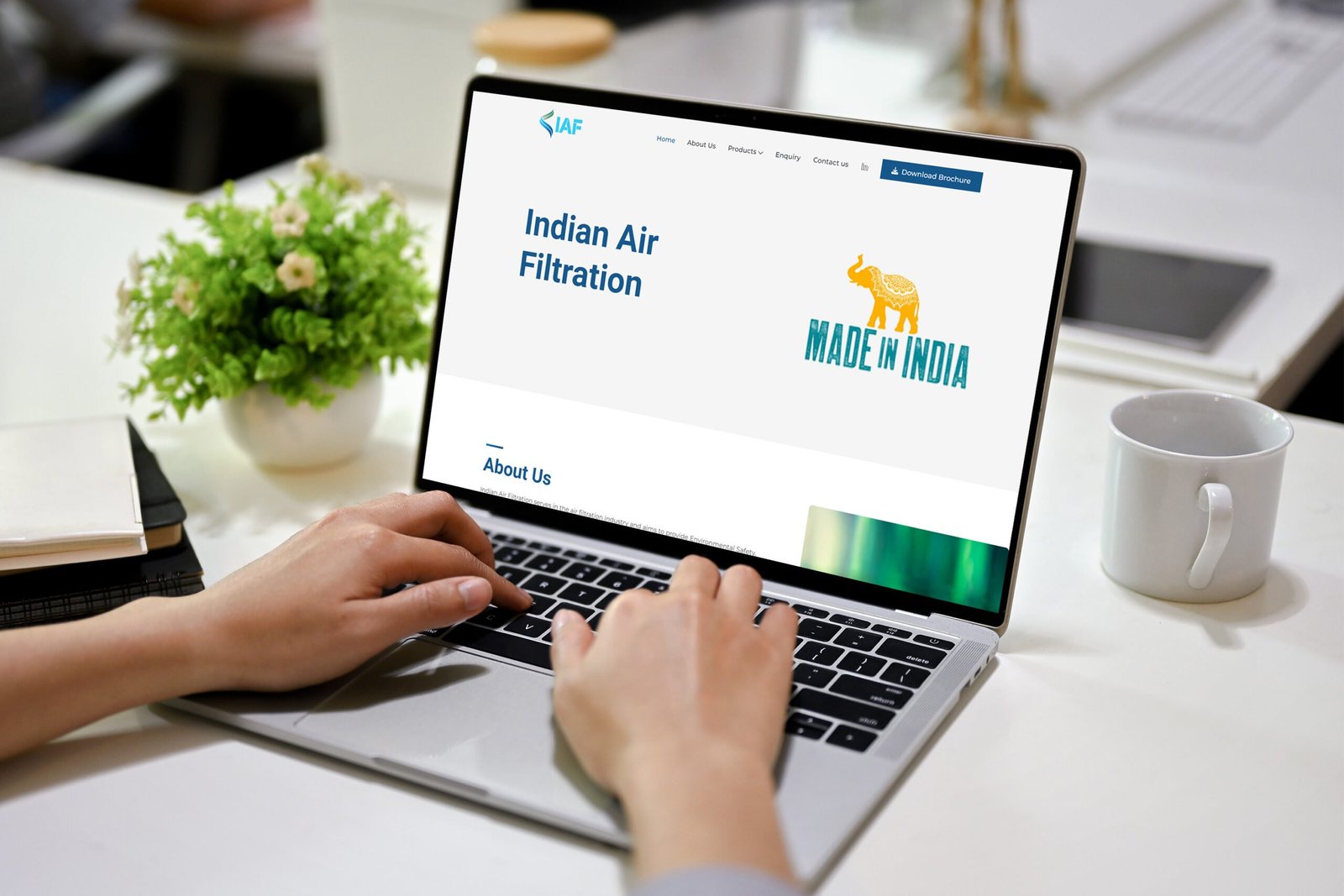
Helping visitors find the right information IAF needed a website structure that could make its products and business information easier to browse.…

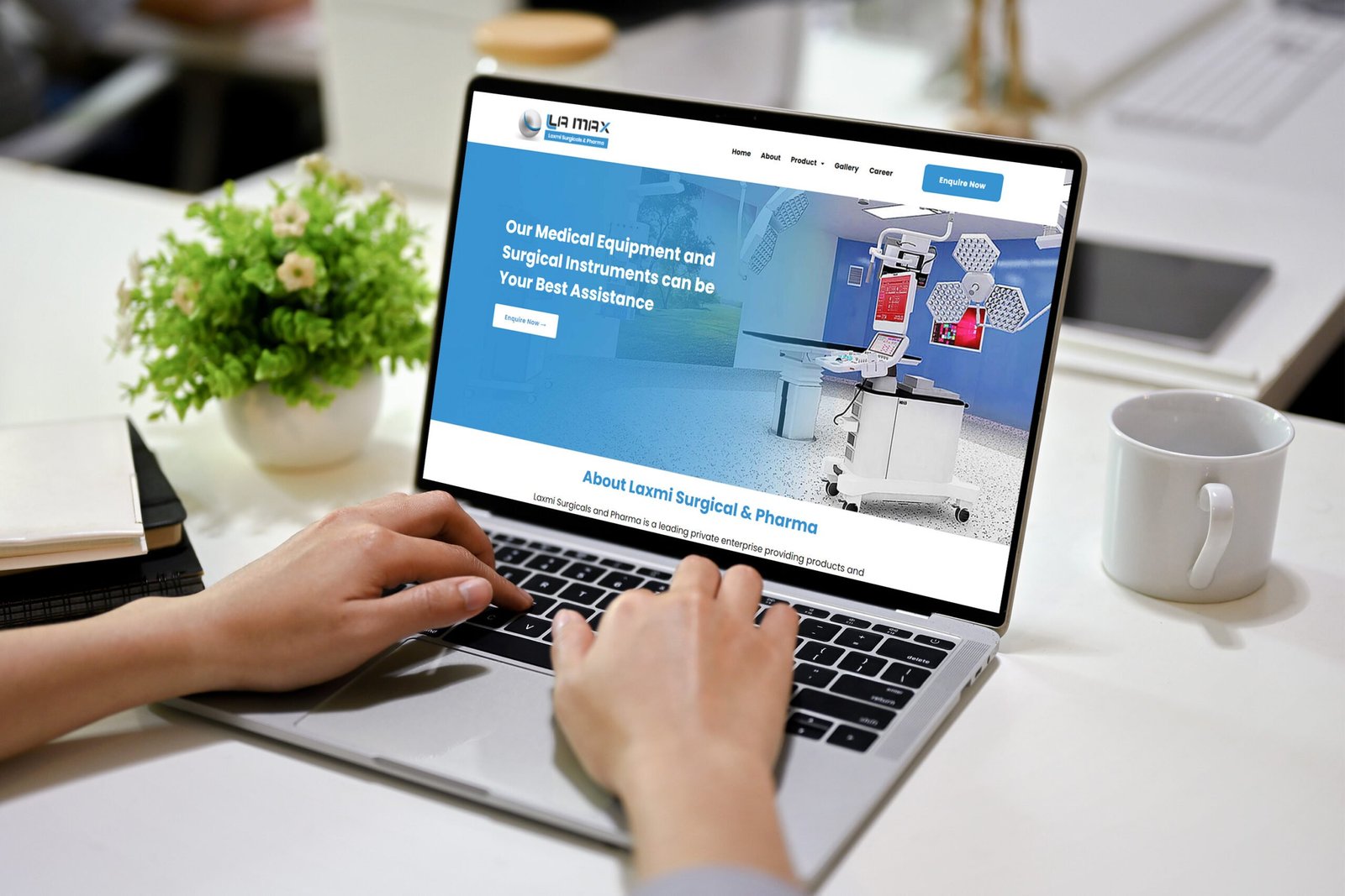
A cleaner route through the content The LAMAX website direction starts with a simple question: what does a visitor need to understand…
Selected digital marketing work, built around a clear idea and a usable finish.
Explore this set
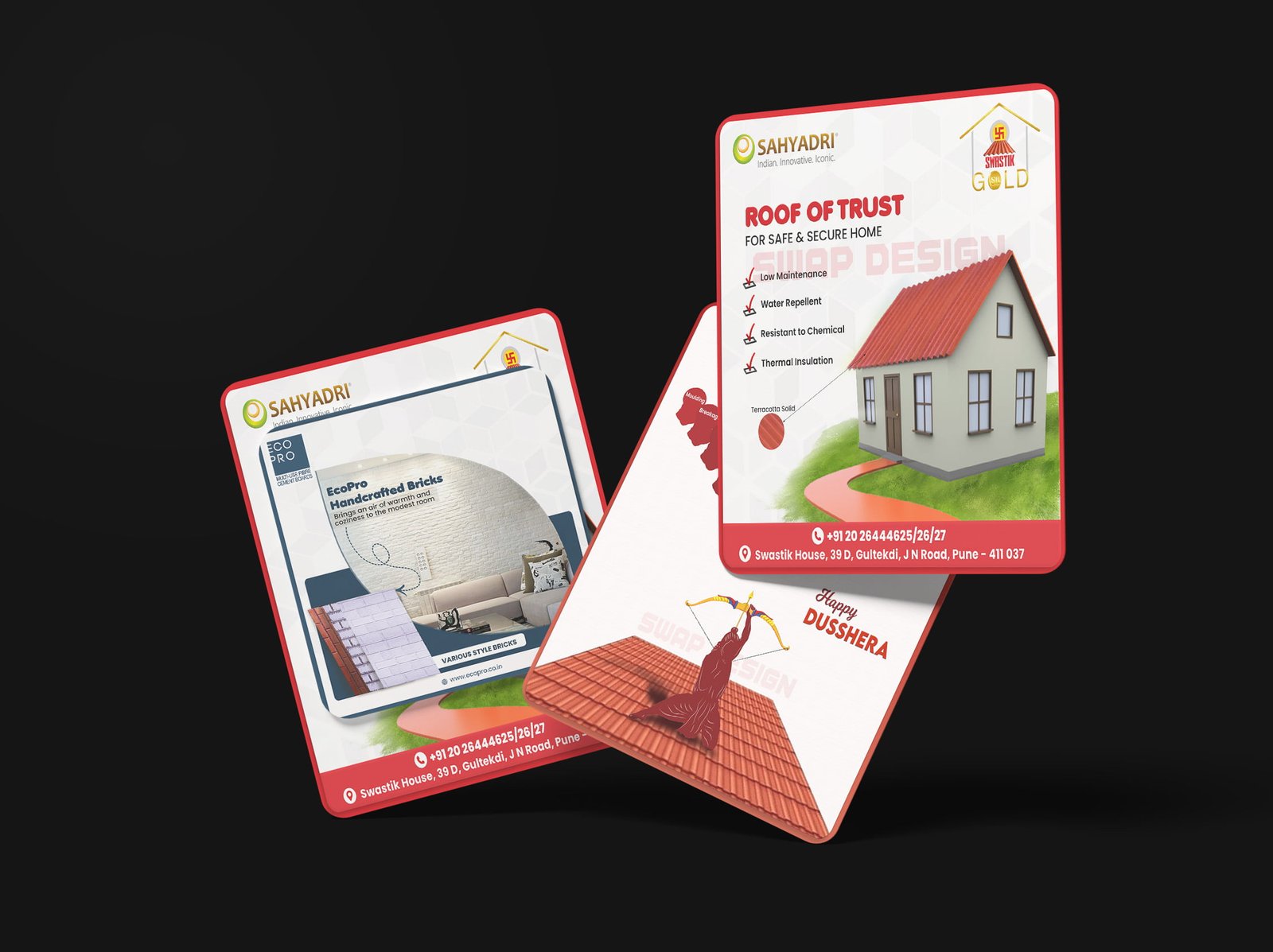
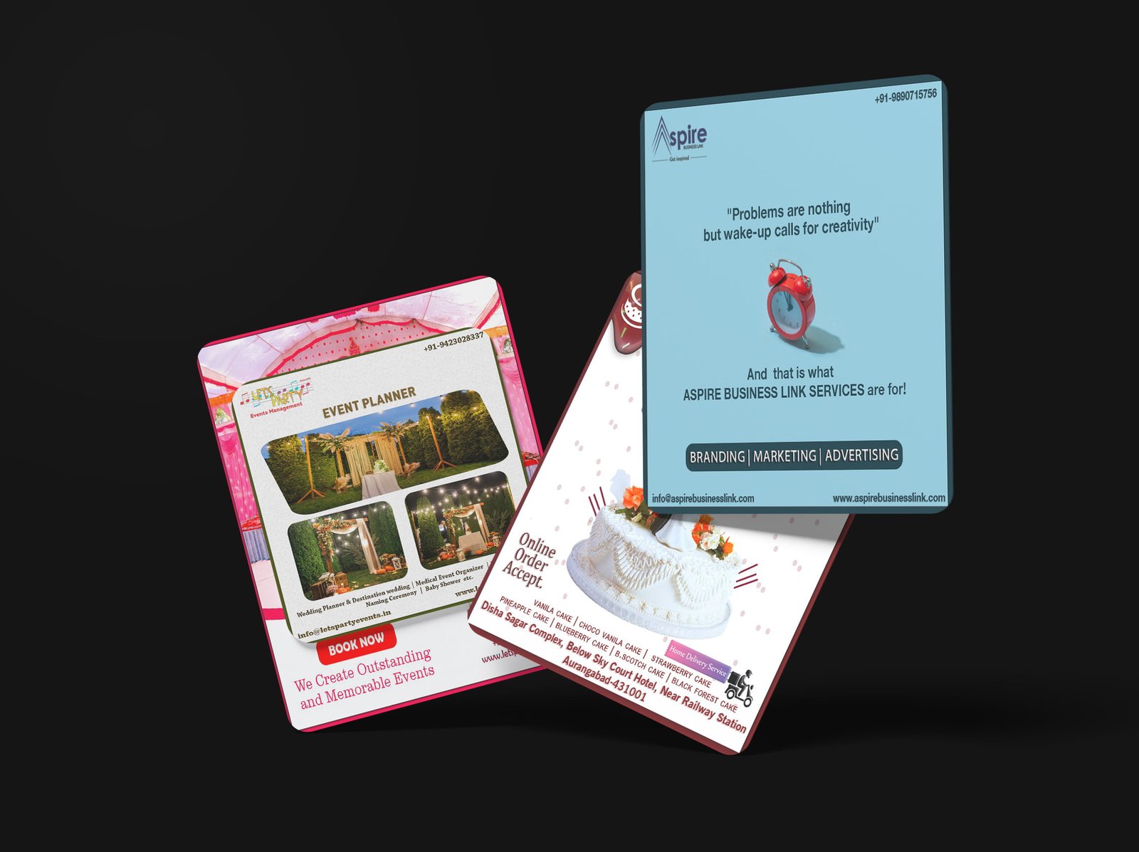
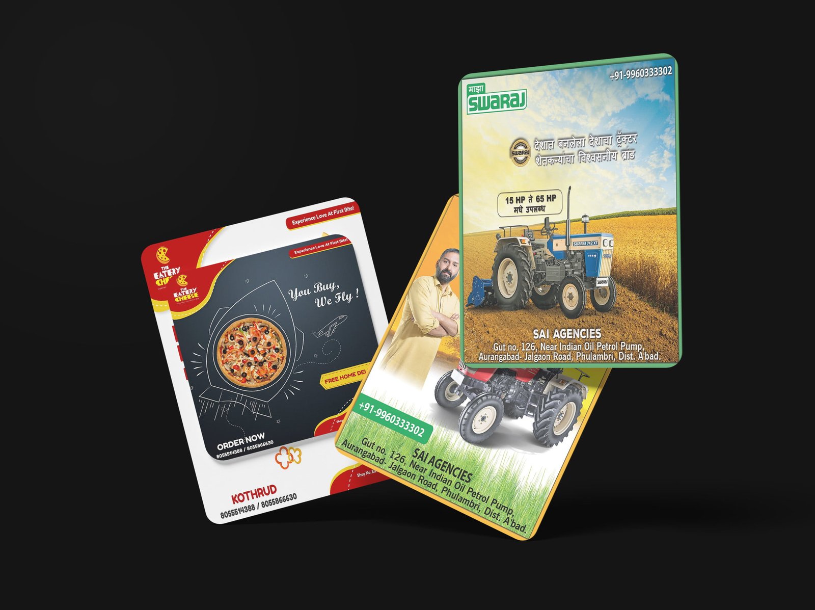
Making the campaign recognisable This social media creative project focuses on consistency. Each visual needs to stand out in a fast-moving feed…

One campaign, multiple touchpoints The campaign direction was designed to work across different social formats without losing its central message. That makes…

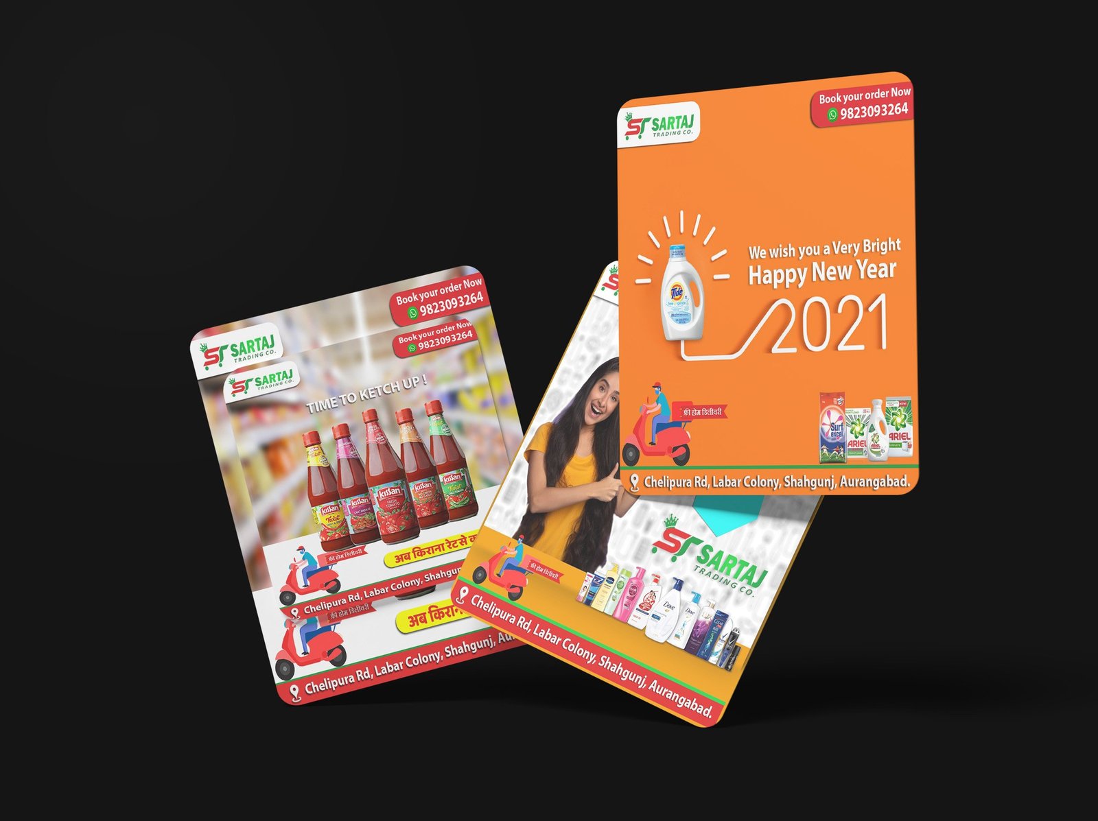
Creating a recognisable feed Sartaj needed social content that could feel consistent from one post to the next. The visual direction gives…

Designed for the first few seconds Social ads have very little time to earn attention. This project uses a direct visual hierarchy…
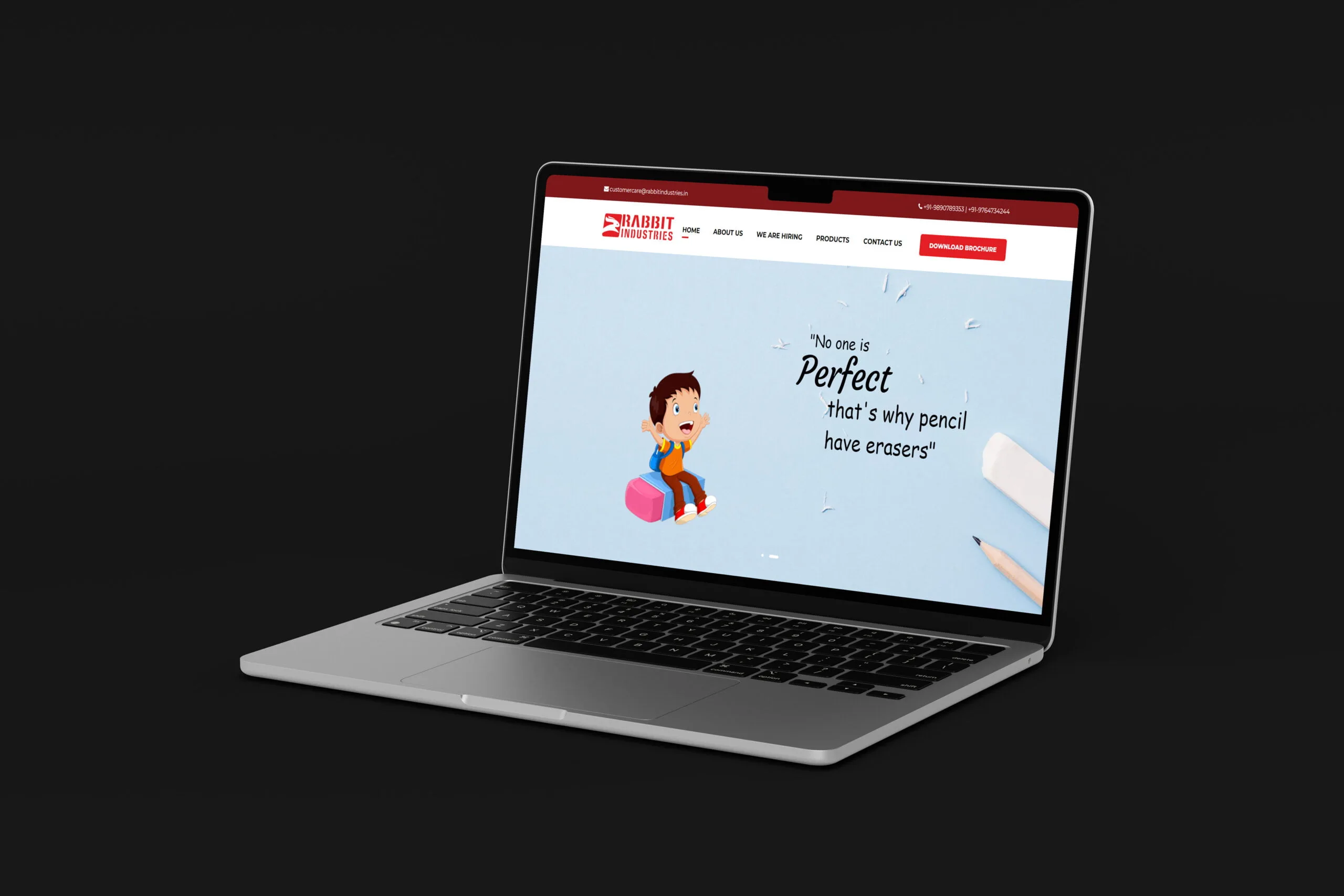
Making the website easier to understand Search visibility starts with useful structure. This project focuses on presenting Rabbit Industries services and business…
A closer look at three websites and content systems built for different businesses.
A connected website, blog and LinkedIn content system for B2B demand generation.
A custom WordPress website explaining solar services for homes and businesses.
An editorial technology website built for regular publishing and social content.
These are the questions people usually ask before starting a design or website brief.
The portfolio includes logo and brand identity work, graphic and packaging design, business websites, and digital marketing creatives.
Yes. Send the business context, audience, and intended outcome through the contact page to discuss a suitable starting point.
Swap Design works remotely with businesses in India and with clients worldwide.