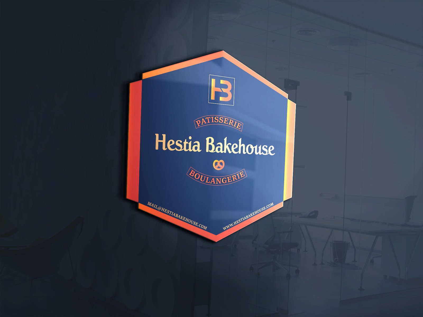
What was the focus of the Hestia Bakehouse Logo project?
Brand identity, visual direction, and practical print touchpoints.
Visual direction, practical detail, and a finish made for the real-world touchpoint.
Warmth before decorationHestia Bakehouse needed an identity that felt welcoming from the first glance. The visual direction uses a simple, approachable mark so the name and the feeling of fresh baking can lead the…
A closer look at the decisions, structure, and finish behind this selected project.
Hestia Bakehouse needed an identity that felt welcoming from the first glance. The visual direction uses a simple, approachable mark so the name and the feeling of fresh baking can lead the communication.
The logo was considered across labels, takeaway packaging, social posts, and storefront use. Clear proportions help it stay recognisable whether it is printed large or used as a small digital badge.
The result is a flexible bakery identity that can grow into menus, seasonal campaigns, and customer-facing packaging without losing its character.
Open the project visual for a larger view. Each selected project image is shown here as part of the full project gallery.
A few plain answers for anyone comparing similar design work.
Brand identity, visual direction, and practical print touchpoints.
Logo & Branding Design work, including Clear visual hierarchy, Useful across real touchpoints, A finish that stays easy to use.
Yes. Share your brief, audience, and intended use through the contact page and Swap Design can suggest a practical starting point.