Web Design Checklist for B2B Startups
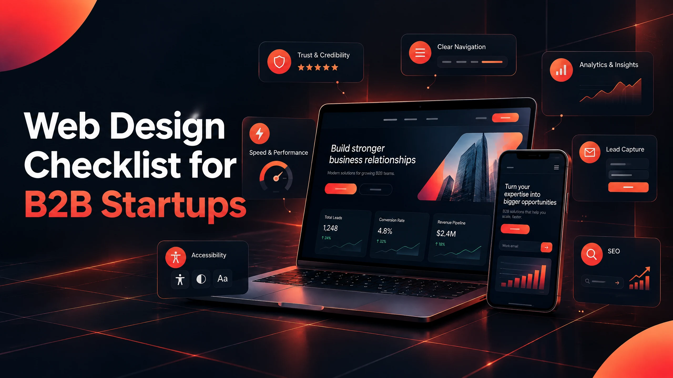
Web Design Checklist for B2B Startups — a practical launch guide for founders and small B2B teams.
Web Design Checklist for B2B Startups
A B2B startup website has a difficult job. It needs to explain a new offer, reassure people who have never heard of the company, answer questions from several decision-makers, and make it easy to take the next step.
That is a lot to ask from a homepage.
I have seen startup websites that looked polished but still left visitors asking basic questions: What exactly does this company do? Is it meant for a business like mine? What happens after I book a call? Is there any proof that the team can deliver?
This checklist is built around those questions. It is not a list of design trends to tick off for the sake of a launch. It is a practical review of the pages, content, technical details, and conversion paths a B2B startup should check before sending the new website to prospects.
Short answer: A launch-ready B2B startup website needs a clear offer, a focused sitemap, proof, useful buyer information, fast mobile pages, crawlable content, accessible interactions, and a CTA that matches the visitor’s level of interest.
1. Write down the website’s job before opening Figma
“Build a new website” is not a useful goal on its own. Decide what the site must help the business do.
For a B2B startup, the first goal may be qualified demo requests. It could also be getting pilot conversations, recruiting partners, explaining a technical product, or helping a sales team follow up after an introduction. These goals lead to different page structures and different calls to action.
Write down three numbers before the project starts: the main conversion you want, the current baseline if the old site exists, and the time period you will use to review progress. You do not need perfect data. You do need a starting point.
2. Make the first screen understandable in a few seconds
A visitor should not need to decode a clever headline before understanding the offer. The first screen should answer four simple questions:
- - Who is this for?
- - What problem does it solve?
- - What changes after using it?
- - What should I do next?
A useful B2B homepage headline is usually more specific than “The future of business, simplified.” Try naming the audience, the problem, and the outcome instead.
For example: “Project reporting for construction teams that are tired of chasing updates across spreadsheets.” It may not sound grand. That is fine. A buyer can understand it.
Use one primary CTA in the hero section. “Book a demo,” “Request a pilot,” “Talk about your workflow,” and “See how it works” each suggest a different level of commitment. Choose the one that matches the conversation you are ready to have.
3. Build a sitemap around buyer questions
A B2B startup website rarely needs twenty pages at launch. It needs the right pages in a sensible order.
A useful starting sitemap often includes:
- - Homepage
- - Product or service overview
- - Individual solution or use-case pages
- - Industries or audience pages, only where the differences are real
- - About or team page
- - Proof, case studies, or customer stories
- - Resources or insights
- - Contact, demo, or pilot page
- - Privacy, terms, and other trust pages
Each important page should have one main job. A service page should explain the service and move the visitor toward a relevant conversation. A blog post should answer a real question and guide the reader to the next useful page. A case study should make the result and the route to that result easy to understand.
Do not hide the important pages inside a complicated mega-menu. If a page matters to a buyer, it should be easy to find from the main navigation or from a relevant page in the journey.
4. Write for the buying group, not just the founder
B2B websites often speak to the person who found the company first. That person is not always the final decision-maker.
A founder may care about speed and market traction. A marketing lead may want a clear story and usable content. An operations lead may ask about implementation, integrations, support, and risk. A finance stakeholder may want pricing logic and a realistic payback discussion.
You do not need a separate page for every job title. You do need enough detail for a champion to explain the offer internally. Add use cases, implementation information, FAQs, security or process details, and proof where those questions naturally arise.
5. Show proof beside the claim it supports
A row of logos at the bottom of the homepage is not a complete trust strategy. Proof works better when it appears close to the decision it supports.
Place a relevant customer result near the service or feature being discussed. Explain what changed, how long the work took, and what the customer actually needed. If you are too early for case studies, use founder experience, a clear delivery process, product screenshots, pilot details, sample outputs, or a transparent explanation of what is still being tested.
Do not invent impressive numbers because a page feels empty without them. A specific explanation of the work is more credible than a vague claim about “transforming businesses.”
6. Give every page a sensible next step
A visitor who is still learning should not be forced into a long sales form. A visitor comparing vendors should not be sent back to a generic homepage.
Use different CTAs for different levels of intent. An educational article can point to a related guide or a short consultation. A solution page can invite a demo or project discussion. A case study can link to the relevant service and a contact form. The wording should tell people what happens next.
On Swap Design pages, a relevant next step can point to the website design and development service or directly to the contact form, depending on how ready the reader appears to be.
7. Keep the enquiry form short enough to complete
A B2B form should collect information that helps the first conversation. It does not need to become a discovery workshop.
Ask for the person’s name, work email, company or website, the type of help needed, and a short description of the problem. Add a service selector if it helps route enquiries. If a field will not change what happens next, question whether it belongs in the first form.
Explain what happens after submission. “We reply within one business day” is more useful than “Submit your information.” Make sure the form works with a keyboard, shows clear labels, and gives a readable error message when something is missing.
8. Explain the process, not just the deliverable
A new B2B buyer is also judging the risk of working with you. A page that says only “custom solutions” leaves too much to the visitor’s imagination.
Show the main steps. For a startup website project, that might be discovery, sitemap and messaging, design, development, testing, launch, and ongoing support. Keep the explanation honest. Do not promise a fixed timeline if the scope is not clear.
This is also a good place to link to practical support such as website maintenance packages. A startup may not need a large retainer, but it should know who will handle updates, backups, fixes, and improvements after launch.
9. Design the mobile version as a primary experience
Many B2B teams review the desktop design first and treat mobile as a smaller version of it. That is how cramped navigation, long hero sections, tiny buttons, and difficult forms reach production.
Test the pages on a real phone. Check the first screen, menu, forms, tables, screenshots, sticky elements, and long sections. Make sure the main CTA is visible without taking over the whole screen.
A mobile check is not only about width. It is also about attention. A page that makes a prospect scroll past three decorative sections before reaching the useful information is asking too much.
10. Keep the page fast enough for a real buyer
Large hero images, unnecessary animation, tracking scripts, chat widgets, and heavy page builders can make a good message arrive too late.
Resize images before uploading them. Use modern formats where the setup supports them. Do not lazy-load the main image that appears immediately on screen. Remove unused sections and plugins instead of adding another performance plugin every time a report shows a warning.
Test important pages on mobile and review the actual bottleneck. This Elementor speed guide covers a practical no-code process for checking images, scripts, caching, fonts, hosting, and Core Web Vitals.
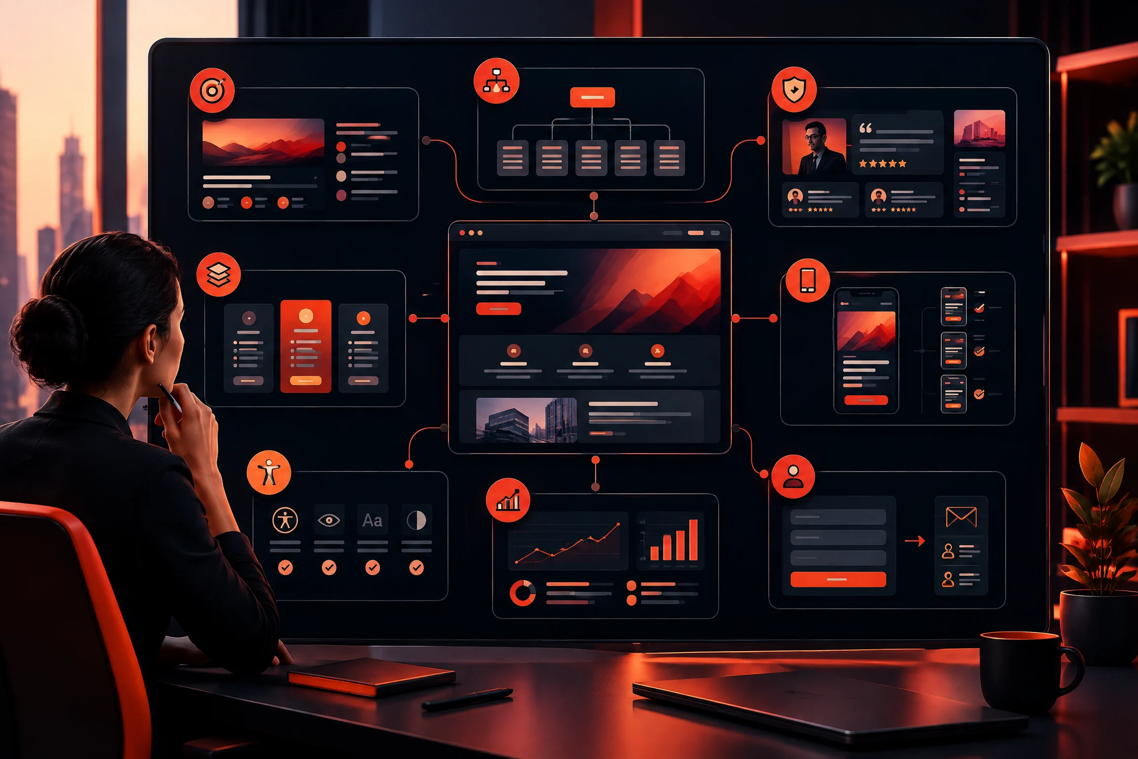
Website planning works better when messaging, structure, proof, and conversion paths are reviewed together rather than as separate design tasks.
11. Give search engines a clear page to understand
A B2B website SEO checklist starts with useful content, not a pile of repeated keywords. Each page should have a unique title, a clear H1, a useful description, and content that matches the reason someone would visit.
Use descriptive URLs. Link related pages with anchor text that tells the reader what is behind the link. Add relevant image alt text. Check that important pages can be reached through ordinary links and are not dependent on a form submission or a script that search engines cannot follow.
For a startup, the best initial keyword opportunities are often specific questions and problems. “B2B website design checklist,” “website redesign for a SaaS startup,” and “how to plan a B2B website” may be more useful than a broad term that has no clear connection to the offer.
Google’s own guidance recommends useful, readable, original content, clear titles and snippets, descriptive links, and images with relevant context and alt text [1]. Those basics also help answer engines and AI systems understand the page.
12. Format important answers for people and answer engines
Answer-focused optimization is not about writing robotic paragraphs for a machine. It is about making the answer easy to find.
Start important sections with a direct answer, then add the explanation. Define abbreviations such as CTA, SEO, and Core Web Vitals the first time they appear. Use question-based subheadings when they reflect real buyer questions. Keep one idea in each paragraph and avoid hiding the answer under a long introduction.
A short checklist, a process explanation, and a useful FAQ can help a reader skim the article and can give search systems clearer passages to interpret. The content still needs to be accurate and written for humans.
13. Check accessibility before launch
Accessibility is part of a usable B2B website. It also catches problems that affect everyone, not only people using assistive technology.
Check text contrast, keyboard navigation, visible focus states, form labels, heading order, link purpose, image alt text, and the ability to pause or avoid distracting motion. Do not use colour as the only way to communicate a status or error.
A simple manual pass is worthwhile. Try to complete the main enquiry path without a mouse. Zoom the page. Read the headings in order. Test an error state. Fix what blocks a real task first.
14. Install measurement before announcing the launch
A website cannot improve if nobody can see what happens after launch.
Set up analytics, Search Console, form notifications, and a simple conversion definition before traffic arrives. Track the actions that matter: completed enquiries, demo requests, calls, downloads, or qualified conversations. Do not treat every page view as a business result.
Check the first week for broken links, missing tracking, form failures, unexpected spam, slow pages, and search-indexing problems. The launch is the beginning of the review period, not the end of the project.
15. Plan the first three months after launch
Startups change quickly. The website should have a small maintenance plan rather than being left untouched after launch.
Review which questions prospects keep asking. Compare the pages that bring visitors with the pages that create conversations. Update claims when the product changes. Add proof when a pilot becomes a customer story. Consolidate articles that overlap instead of publishing three thin versions of the same topic.
If updates have not been tested carefully, WordPress maintenance support can reduce the chance that a plugin update or small content change breaks an important page. A previous article on why WordPress updates matter explains the maintenance side in more detail.
B2B startup website launch checklist
Before launch, ask these questions:
- - Can a first-time visitor explain what the company does after reading the homepage?
- - Is the main audience visible in the headline and page copy?
- - Does every important page have a clear purpose and next step?
- - Can a buyer find proof without searching through the footer?
- - Does the form ask only for information needed at the first stage?
- - Does the mobile version work comfortably on a real phone?
- - Have image sizes, scripts, fonts, and page-builder settings been reviewed?
- - Are titles, headings, URLs, internal links, and alt text in place?
- - Can a keyboard user navigate the menu and complete the form?
- - Are analytics, Search Console, form alerts, and conversion events working?
- - Is there an owner for updates, backups, fixes, and content changes after launch?
If several answers are “not yet,” the site may need another review before it is promoted heavily. That is usually cheaper than sending prospects to a page that makes them work too hard.
A practical next step
Do not try to fix every part of the website in one afternoon. Pick the page that matters most to the business, run through this checklist, and write down the three biggest sources of confusion or friction.
Then fix those three things first. A clearer headline, a shorter form, or a better proof section can matter more than another round of visual polishing.
If you are planning a B2B startup website or redesign and want a second opinion, tell Swap Design about the project through the contact form. Share the page, the audience, and what you want the website to help you achieve.