
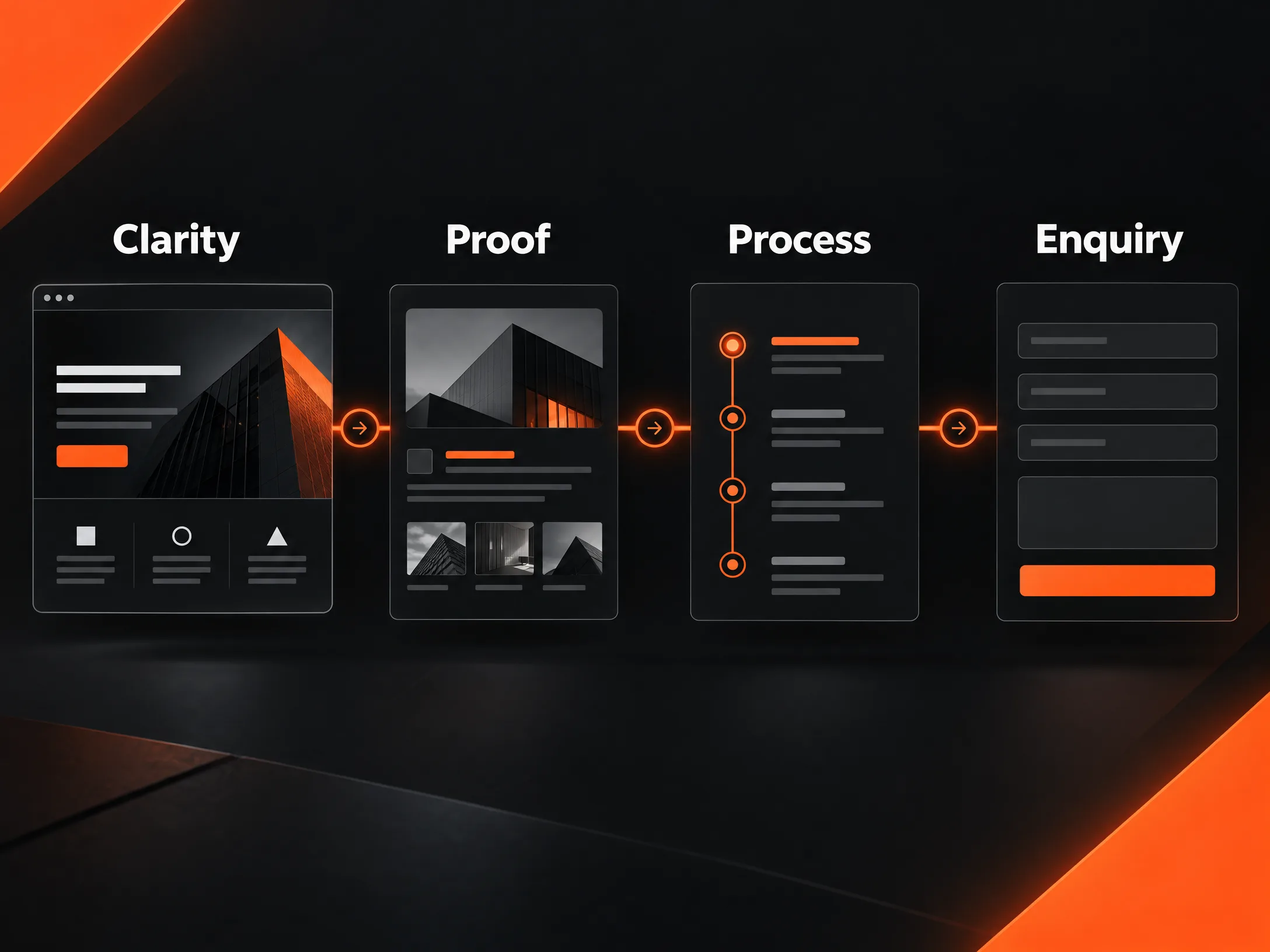
A good B2B website design gives a potential buyer somewhere useful to start after a referral, a search, or a sales email. They may spend three minutes there—or twenty. In that short window, the site has to answer questions the sales team may never hear: What does this company actually do? Have they handled work like ours? Can they explain the process clearly? What happens if we get in touch?
The visual side matters, but so does the information behind it. If a visitor has to work too hard to understand the offer, a competitor with a clearer message gets the next conversation.
A B2B website should help someone make a decision
Many B2B sites are arranged around the company’s departments. About us. Services. Industries. Contact. It is tidy, but it may not match the way a buyer thinks.
Good B2B web design gives them a route through the site. A service page should explain the situation it addresses, what the work involves, what the client receives, and what the next step looks like. That structure is more useful than a page filled with broad claims about excellence.
Start with the questions buyers ask in private
The questions that shape a buying decision are not always the ones companies put on their websites.
A procurement manager may want to know how the engagement is priced and approved. A technical reviewer may look for integrations, security information, or delivery details. A director may care about commercial risk and the likely result. The person who first finds the site may be trying to collect enough information to send an internal email.
A good website gives each of them something useful without turning the page into a wall of technical text. Put a plain-English explanation first. Then add detail for readers who need it: process notes, specifications, FAQs, delivery stages, or a downloadable capability document.
That is the practical difference between B2B UX design and a layout that merely looks clean: less effort to find the next useful answer.
Explain the service without hiding behind jargon
Complex services do not become easier to buy when every paragraph is packed with specialist language. The reader may understand the terms and still not understand what the company will actually do.
Take a managed IT service. “Proactive infrastructure monitoring with multi-layered endpoint protection” sounds serious, but it leaves a basic question unanswered: what changes for the client on a normal Tuesday?
A clearer version might explain that the team watches systems, flags unusual activity, responds to incidents, and provides a regular report. The technical terms can follow. They should support the explanation, not replace it.
This also matters in B2B website development. The site itself should be built around the service’s real buying process. If a prospect needs to compare packages, read a case study, check technical requirements, and request a conversation, those actions should feel connected rather than scattered across unrelated pages.
Show proof close to the claim
“Trusted by businesses worldwide” is easy to write and hard to believe. It tells the visitor almost nothing.
A useful case study does more work. What was the client struggling with? What did the team change? How long did the work take? What improved afterwards? Even a modest result is more convincing when the reader can understand the starting point.
For a professional services website design project, this evidence is particularly important. Visitors cannot hold the service in their hands or inspect it on a shelf. They judge the firm through its thinking, its examples, its people, and the clarity of its process.
Build pages for the sales conversation you want
A B2B website redesign often begins with a visual complaint. The homepage looks dated. The navigation feels crowded. The pages do not work well on a phone.
Those problems matter, but they are rarely the whole problem. Before changing colours or moving sections around, look at the questions the current site leaves unanswered.
Can a visitor tell which service is relevant to them? Are the case studies connected to the services they describe? Does the enquiry form ask for too much before any trust has been built? Can someone forward a useful page to a colleague without adding a long explanation?
A stronger B2B website redesign fixes the route through the site, not only the surface. It may mean combining thin service pages, rewriting a vague headline, adding industry-specific examples, or moving a technical FAQ much closer to the decision point.
Give visitors more than one sensible next step
Not every visitor is ready to book a call. Some are still comparing providers. Others have a specific technical question. A few may need a document they can share internally before they speak with anyone.
A good B2B lead generation website makes room for these different levels of interest. It can offer a project estimate, a short discovery call, a relevant case study, a capability overview, or a direct question to the team. The wording should tell people what will happen next.
“Submit your details” creates uncertainty. “Request a project estimate” gives the visitor a clearer reason to continue. “Ask about your requirements” works well when the scope is still forming.
Keep one main action on each page. Supporting links are useful, but a page with five equally bright buttons makes the business look unsure about what it wants the visitor to do.
Design for the people behind the first enquiry
B2B purchases rarely belong to one person. The first visitor may be a marketing manager. The next reader could be someone from finance, operations, procurement, or IT.
That does not mean the website needs a separate page for every job title. It does mean the content should cover the concerns that can slow an internal decision: delivery times, responsibilities, risks, support, technical fit, approvals, and expected outcomes.
This is a practical part of B2B website strategy. Decide which questions need a page, which need a short section, and which belong in an FAQ or downloadable document. Leave gaps and the sales team ends up answering the same basic questions in every call.
Do not leave performance until the end
A beautiful page that takes too long to load is still a poor first impression. The same is true of a mobile layout that makes someone pinch sideways, or a form that loses its labels when tapped.
Check the basics: image weight, font loading, heading order, keyboard navigation, colour contrast, form errors, and the tap size of buttons. Read the page on a small screen. Try the enquiry process with a slow connection.
These details support B2B website conversion because they remove small reasons to stop. A page that loads quickly, explains the offer plainly, shows relevant proof, and gives a clear next step is easier to remember—and share internally.
Questions buyers often ask about B2B website design
What is B2B website design?
B2B website design is the planning, writing and visual design of a website that helps one business understand and evaluate another business. It needs to support research, internal comparison, trust-building and the first sales conversation.
How is B2B web design different from a normal business website?
B2B web design usually has a longer decision path. Several people may review the site, the service may be difficult to explain in one sentence, and the visitor may need evidence before making contact. The content therefore has to answer practical, technical and commercial questions.
When does a B2B website need a redesign?
A B2B website redesign is worth considering when visitors cannot find the right service, sales enquiries are poorly qualified, important pages are outdated, the site performs badly on mobile, or the website no longer reflects the company’s real work.
How can a B2B website generate better leads?
A B2B lead generation website should explain the offer clearly, show relevant proof, match pages to buyer intent and make the next step easy to understand. The form is only one part of that job.
A final check before the site goes live
Ask someone outside the project to open the homepage and find the service that fits a stated problem. Do not help them. Watch where they pause.
Then ask what they think the company does, who it seems to serve, and what they expect to happen if they enquire. The gaps in their answers are often more useful than another internal review meeting.
A B2B website earns its place by making the next conversation easier to start.