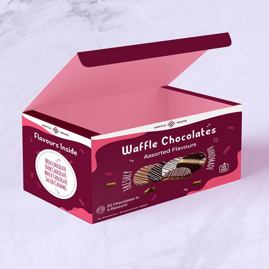
What was the focus of the Waffle Product Packaging project?
Packaging, promotional visuals, and clear communication-led layouts.
Visual direction, practical detail, and a finish made for the real-world touchpoint.
A visual cue people understand quicklyThis packaging project focuses on making the waffle product feel tempting before the pack is opened. The composition gives the product and its taste-led message enough space to lead.Keeping…
A closer look at the decisions, structure, and finish behind this selected project.
This packaging project focuses on making the waffle product feel tempting before the pack is opened. The composition gives the product and its taste-led message enough space to lead.
Colour, type, and image hierarchy were balanced so the pack can communicate quickly in a busy display. The visual language stays friendly without losing product clarity.
The final concept gives the product a strong starting point for flavours, sizes, promotional versions, and future retail material.
Open the project visual for a larger view. Each selected project image is shown here as part of the full project gallery.
A few plain answers for anyone comparing similar design work.
Packaging, promotional visuals, and clear communication-led layouts.
Graphic Design work, including Clear visual hierarchy, Useful across real touchpoints, A finish that stays easy to use.
Yes. Share your brief, audience, and intended use through the contact page and Swap Design can suggest a practical starting point.