What was the focus of the Fast Food Packaging project?
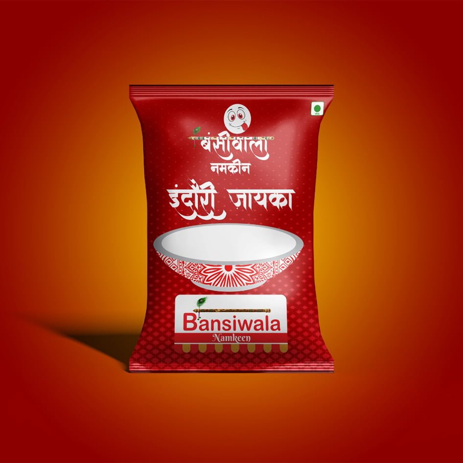
A red Bansiwala Namkeen pack that needed to feel familiar, appetising, and easy to recognise at a glance.
Visual direction, practical detail, and a finish made for the real-world touchpoint.
Making the pack easy to noticeBansiwala Namkeen needed packaging that could feel familiar, appetising, and easy to recognise at a glance. The front-of-pack direction gives the product name and food message a strong visual…
A closer look at the decisions, structure, and finish behind this selected project.
Bansiwala Namkeen needed packaging that could feel familiar, appetising, and easy to recognise at a glance. The front-of-pack direction gives the product name and food message a strong visual position.
Red and orange contrast create energy while the layout keeps the product information readable. The design is expressive enough to attract attention but organised enough to work across a product range.
The final packaging direction supports retail visibility, product photography, and social promotion with a consistent brand finish.
Open the project visual for a larger view. Each selected project image is shown here as part of the full project gallery.
A few plain answers for anyone comparing similar design work.
A red Bansiwala Namkeen pack that needed to feel familiar, appetising, and easy to recognise at a glance.
Graphic Design work, including A clear front-of-pack hierarchy, Red and orange contrast that earns attention, Brand and product recall in one glance.
Yes. Share your brief, audience, and intended use through the contact page and Swap Design can suggest a practical starting point.