What was the focus of the Farming Pamphlet Design project?
Brand identity, visual direction, and practical print touchpoints.
Visual direction, practical detail, and a finish made for the real-world touchpoint.
Putting useful information firstThis farming pamphlet was shaped for readers who need to understand the message quickly. The layout gives key points a clear place so the material can be scanned without losing context.Readable…
A closer look at the decisions, structure, and finish behind this selected project.
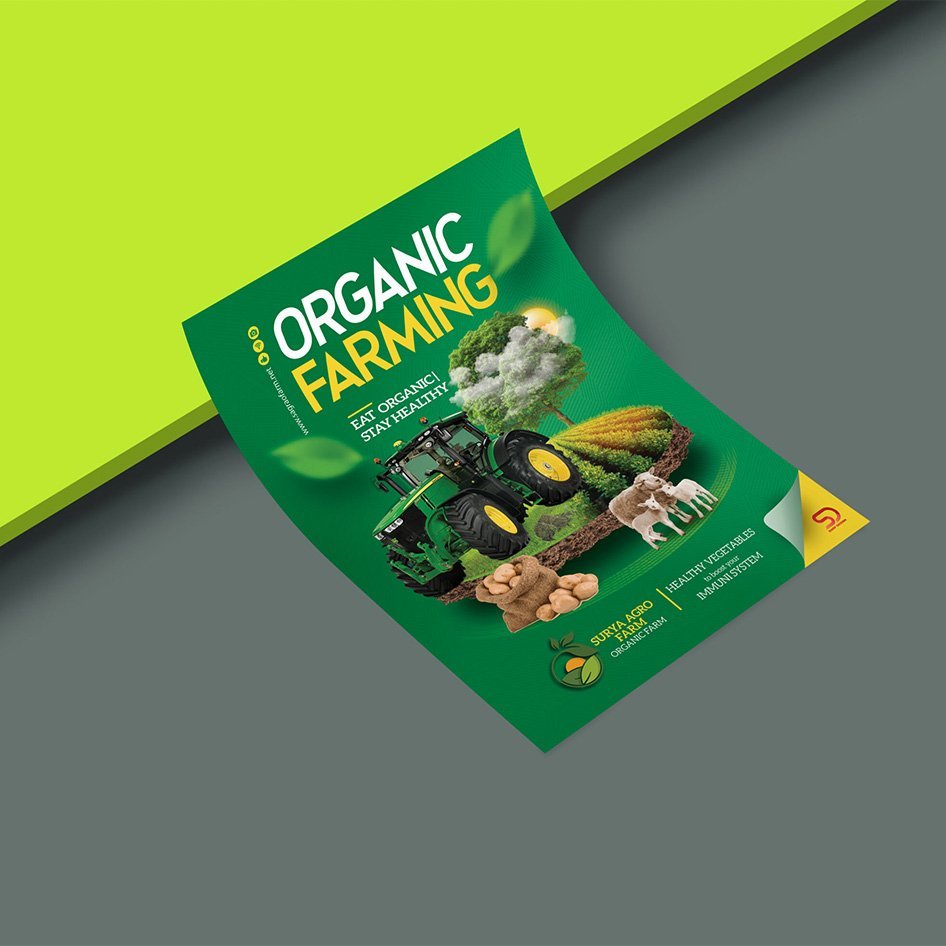
This farming pamphlet was shaped for readers who need to understand the message quickly. The layout gives key points a clear place so the material can be scanned without losing context.
Typography, spacing, and image placement were kept practical for a printed handout. The visual hierarchy helps important details stand out while keeping the overall piece balanced.
The result supports outreach with a clear structure that can be reused for future farming updates, campaigns, and educational material.
Open the project visual for a larger view. Each selected project image is shown here as part of the full project gallery.
A few plain answers for anyone comparing similar design work.
Brand identity, visual direction, and practical print touchpoints.
Logo & Branding Design work, including Clear visual hierarchy, Useful across real touchpoints, A finish that stays easy to use.
Yes. Share your brief, audience, and intended use through the contact page and Swap Design can suggest a practical starting point.