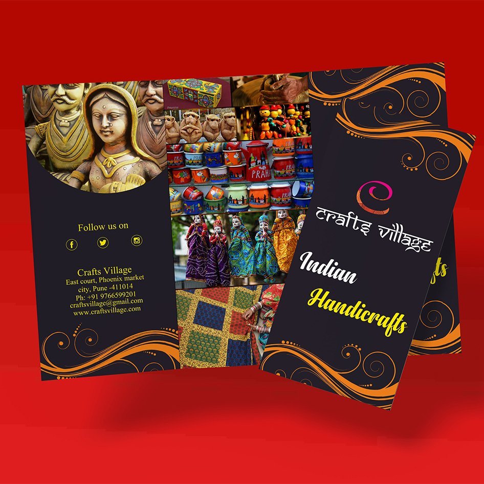
What was the focus of the Craft Village Brochure project?
Brand identity, visual direction, and practical print touchpoints.
Visual direction, practical detail, and a finish made for the real-world touchpoint.
Information that feels easy to exploreCraft Village needed a brochure that could present its story and offerings without turning every page into a wall of text. The design gives the content a clear order…
A closer look at the decisions, structure, and finish behind this selected project.
Craft Village needed a brochure that could present its story and offerings without turning every page into a wall of text. The design gives the content a clear order and enough breathing room to stay approachable.
Headings, imagery, and supporting information work together to guide the reader through the brochure. The visual direction keeps the handmade character present while maintaining a polished finish.
The finished brochure works as a leave-behind, a meeting aid, and a useful introduction to the Craft Village experience.
Open the project visual for a larger view. Each selected project image is shown here as part of the full project gallery.
A few plain answers for anyone comparing similar design work.
Brand identity, visual direction, and practical print touchpoints.
Logo & Branding Design work, including Clear visual hierarchy, Useful across real touchpoints, A finish that stays easy to use.
Yes. Share your brief, audience, and intended use through the contact page and Swap Design can suggest a practical starting point.