What was the focus of the Ashna Mehndi Logo project?
Brand identity, visual direction, and practical print touchpoints.
Visual direction, practical detail, and a finish made for the real-world touchpoint.
A clear identity for a detail-led serviceAshna Mehndi needed a mark that felt personal without becoming decorative noise. The direction keeps the identity easy to recognise across a profile image, appointment card, social post,…
A closer look at the decisions, structure, and finish behind this selected project.
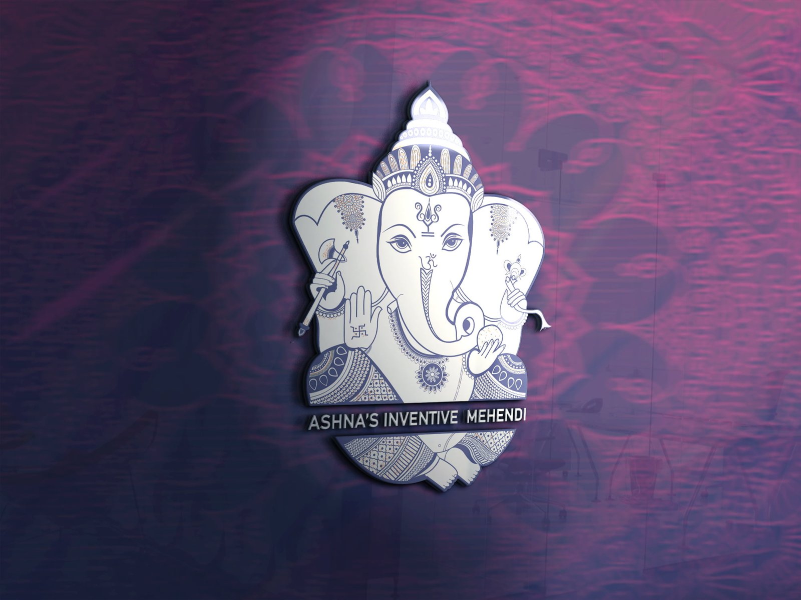
Ashna Mehndi needed a mark that felt personal without becoming decorative noise. The direction keeps the identity easy to recognise across a profile image, appointment card, social post, and printed touchpoint.
The logo was shaped around a balanced wordmark and a distinctive visual cue, giving the brand a memorable signature while keeping the name readable at small sizes.
The final identity gives the business a consistent starting point for future stationery, packaging, and digital communication.
Open the project visual for a larger view. Each selected project image is shown here as part of the full project gallery.
A few plain answers for anyone comparing similar design work.
Brand identity, visual direction, and practical print touchpoints.
Logo & Branding Design work, including Clear visual hierarchy, Useful across real touchpoints, A finish that stays easy to use.
Yes. Share your brief, audience, and intended use through the contact page and Swap Design can suggest a practical starting point.